
Captive Portal Splash Page Best Practices
In Brief: A well-designed captive portal splash page gives guests a fast path to WiFi while supporting authentication, branding, consent, access policies, payments, and customer engagement. The best results come from keeping the mobile experience simple while connecting the portal to the business and network controls behind it.
A guest taps your WiFi name, expects internet in seconds, and lands on a blank, slow, or confusing login screen. That moment does more damage than many operators realize. A captive portal splash page is not just a gateway to connectivity. It is the first digital touchpoint on your network, and it shapes how guests judge your brand, your operations, and even your security posture.
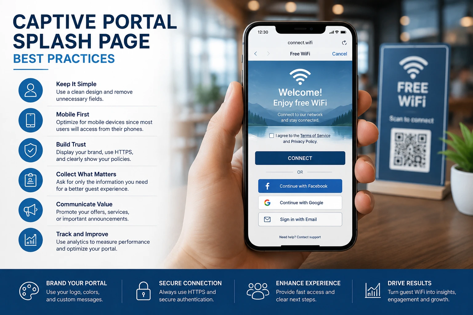
For hotels, restaurants, airports, retail groups, hospitals, and multi-site enterprises, the splash page sits at the intersection of IT control and business performance. It has to authenticate users, apply policy, and protect network resources. At the same time, it can collect consent, support promotions, capture customer data, accept payments, and direct users into a broader engagement flow. When it is designed correctly, it reduces friction and creates measurable value. When it is treated as an afterthought, it becomes a bottleneck.
What a captive portal splash page actually does
A captive portal splash page is the web page users see before receiving guest internet access. In technical terms, it intercepts unauthenticated traffic and presents a login, registration, terms acceptance, or payment screen. In business terms, it is a controlled entry point for every guest session.
That entry point can be simple or highly structured. A small cafe may only need a branded welcome screen with a click-through agreement. A hotel may require room number and last name validation. A hospital may need strict time limits, access segmentation, and legal disclaimers. An airport or retail operator may use the page to deliver ad inventory, loyalty sign-up, multilingual access, or premium paid WiFi tiers.
This is why the splash page should not be evaluated only as a design element. It is part of your access architecture. It influences authentication success rates, support tickets, session conversion, marketing opt-ins, and policy enforcement across one site or hundreds.
Why the captive portal splash page matters to operations and revenue
In many organizations, guest WiFi is still viewed as a basic utility. That is too narrow. Guest access has become a customer experience channel, a data source, and in some environments a direct revenue stream. The captive portal splash page is where those outcomes begin.
From an operational standpoint, a well-built splash page standardizes access across locations. IT teams can apply login methods, device limits, session duration, bandwidth controls, and acceptable use policies without relying on site-by-site workarounds. That consistency matters even more in distributed environments where local staff should not be manually troubleshooting guest access all day.
From a commercial standpoint, the page can support several business models. It can collect verified guest information for CRM or remarketing workflows. It can promote in-venue offers before access begins. It can enable survey collection, coupon distribution, social login, video advertising, or paid access plans. For venues with high foot traffic, those are not minor add-ons. They are monetization tools tied directly to network usage.
There is also a trust factor. Users are increasingly alert to phishing, fake SSIDs, and poor mobile experiences. If your splash page looks outdated, asks for too much information, or fails to load properly, guests may leave or escalate to staff. A clean, branded, mobile-optimized page signals legitimacy and reduces abandonment.
What makes a high-performing captive portal splash page
The best splash pages balance speed, clarity, compliance, and business intent. Too much branding and the page becomes cluttered. Too much data collection and completion rates drop. Too little structure and you lose control over policy, analytics, and downstream engagement.
Fast access with minimal friction
Most guests want one thing first - internet access. The more steps you place between association and connectivity, the more likely users are to quit or call for help. That does not mean every flow should be one-click. It means each field, consent box, and redirect should have a clear purpose.
For a restaurant or cafe, a branded click-through page may be enough. For a hotel, property management integration can justify a room-based login flow because it ties usage to active guests. For a transit hub or airport lounge, paid access or voucher redemption may be operationally necessary. The right approach depends on the venue, the user type, and the security requirement.
Mobile-first design
Most guest WiFi sessions begin on a phone, not a laptop. If the splash page is difficult to read on a small screen, uses oversized graphics, or hides the connect button below the fold, completion rates suffer quickly. Good mobile design means short forms, clear calls to action, readable text, and layout elements that load reliably across iOS, Android, and embedded browser environments.
This is one area where design teams and network teams need to work together. A visually polished page that breaks captive network assistant behavior is not a success. Compatibility matters as much as appearance.
Clear consent and policy language
The splash page is often where businesses collect acceptance of terms of service, privacy notices, age restrictions, or usage disclaimers. These elements protect the operator, but they should not overwhelm the experience. Keep language direct, easy to scan, and appropriate for the environment.
In regulated environments such as healthcare, education, finance, or public institutions, legal and compliance requirements may be more demanding. That is fine, but the flow still needs to feel controlled rather than chaotic. Structure matters.
Useful data capture, not excessive data capture
Many operators want guest information, but asking for too much too early usually lowers completion. Email, phone number, social login, SMS OTP, voucher code, loyalty ID, and payment options can all be valid, depending on the use case. The key is choosing the lightest method that still supports your business objective.
If your goal is repeat marketing, an email-based login may be enough. If you need identity validation, SMS or voucher workflows may fit better. If the audience is transient and high-volume, speed may matter more than profile depth. Good captive portal design starts with the business model, not with a wish list of fields.
Common mistakes that weaken results
A surprising number of splash pages fail for reasons that are easy to avoid. The first is overdesign. Large videos, heavy images, and unnecessary scripts slow page delivery and hurt mobile completion. The second is poor message hierarchy. If users cannot tell where to tap, what they are agreeing to, or how long access will last, confusion follows.
Another common issue is treating every location the same. Standardization is important, but not every venue has the same traffic pattern or guest expectation. A luxury hotel, a university campus, and a quick-service restaurant do not need identical login experiences. Centralized management should support policy consistency while still allowing local branding, language, and workflow differences.
There is also the problem of disconnected systems. If your splash page captures data that never reaches your analytics, CRM, ad reporting, or customer support workflows, the value is limited. The captive portal should be part of a broader operating model, not an isolated login screen.
How to align the splash page with your deployment model
Single-site businesses often focus on ease of setup and speed to launch. Multi-location groups care more about template control, user segmentation, centralized reporting, and delegated administration. Enterprise and service provider deployments usually add requirements around on-premise hosting, external AAA Radius, virtual controllers, hardware compatibility, and white-label management.
That is why the captive portal splash page should be selected and configured in the context of the full platform. The page itself is only one layer. Behind it, you need reliable policy enforcement, session handling, branding controls, analytics, and integration options that scale.
A cloud-managed model often works well when teams need rapid rollout, remote updates, and centralized oversight across dispersed sites. On-premise deployment can make more sense where compliance, latency, or internal policy requires tighter infrastructure control. Neither is automatically better. It depends on your network architecture, internal resources, and governance requirements.
For organizations that want both operational control and commercial return from guest WiFi, platforms such as Start Hotspot are appealing because they bring access control, monetization, marketing, and administration into one managed environment. That reduces fragmentation and makes the splash page more than a cosmetic layer.
Measuring whether your captive portal splash page is working
If success is defined only by whether users get online, you are missing most of the picture. A strong splash page should be measured against technical and business metrics together.
Authentication completion rate shows whether users can actually get through the flow. Time to connect reveals whether the process is too slow. Bounce rate on the login page highlights friction. Support requests tied to guest WiFi expose usability issues. On the business side, opt-in rate, ad engagement, survey response, voucher redemption, and paid access conversion show whether the page contributes to revenue or customer intelligence.
Those metrics should also be segmented by venue type, device type, and login method. A flow that performs well at a hotel may fail in a busy food court. Good optimization starts with context.
The captive portal splash page deserves more attention than it usually gets. It is where guest access, security policy, brand presentation, and commercial opportunity all meet in a single interaction. If that interaction is fast, clear, and aligned with your operating model, guest WiFi stops being a cost center and starts behaving like an asset. Build it with the same discipline you apply to the rest of your network, and it will keep paying back long after the first login.
FAQ
How many fields should a captive portal form have?
Use only the fields the business actually needs. Shorter forms usually reduce login friction, while additional fields should be justified by a clear operational, marketing, or compliance requirement.
Should a captive portal be optimized for mobile devices?
Yes. Most guests open captive portals on smartphones, so the page should load quickly, use readable text, and present the login or connect action without unnecessary scrolling.
Can different locations use different captive portal pages?
Yes. A centrally managed platform can use shared templates while allowing location-specific branding, languages, promotions, access methods, and terms.
Prefer Antamedia on Google
Get practical guest WiFi and network management insights directly from Antamedia.