
12 Guest WiFi Login Page Examples That Convert
In Brief: Effective guest WiFi login pages combine fast access with branding, authentication, consent, data collection, and clear network policies. This guide presents 12 practical portal examples for hotels, restaurants, retail, airports, healthcare, campuses, events, public venues, and other business environments.
A guest WiFi login page does more than let people online. In most venues, it sets the tone for the visit, shapes how much data you can collect, and determines whether your network becomes a cost center or a revenue channel. The best guest wifi login page examples are not just attractive - they are built around access control, compliance, and commercial outcomes.
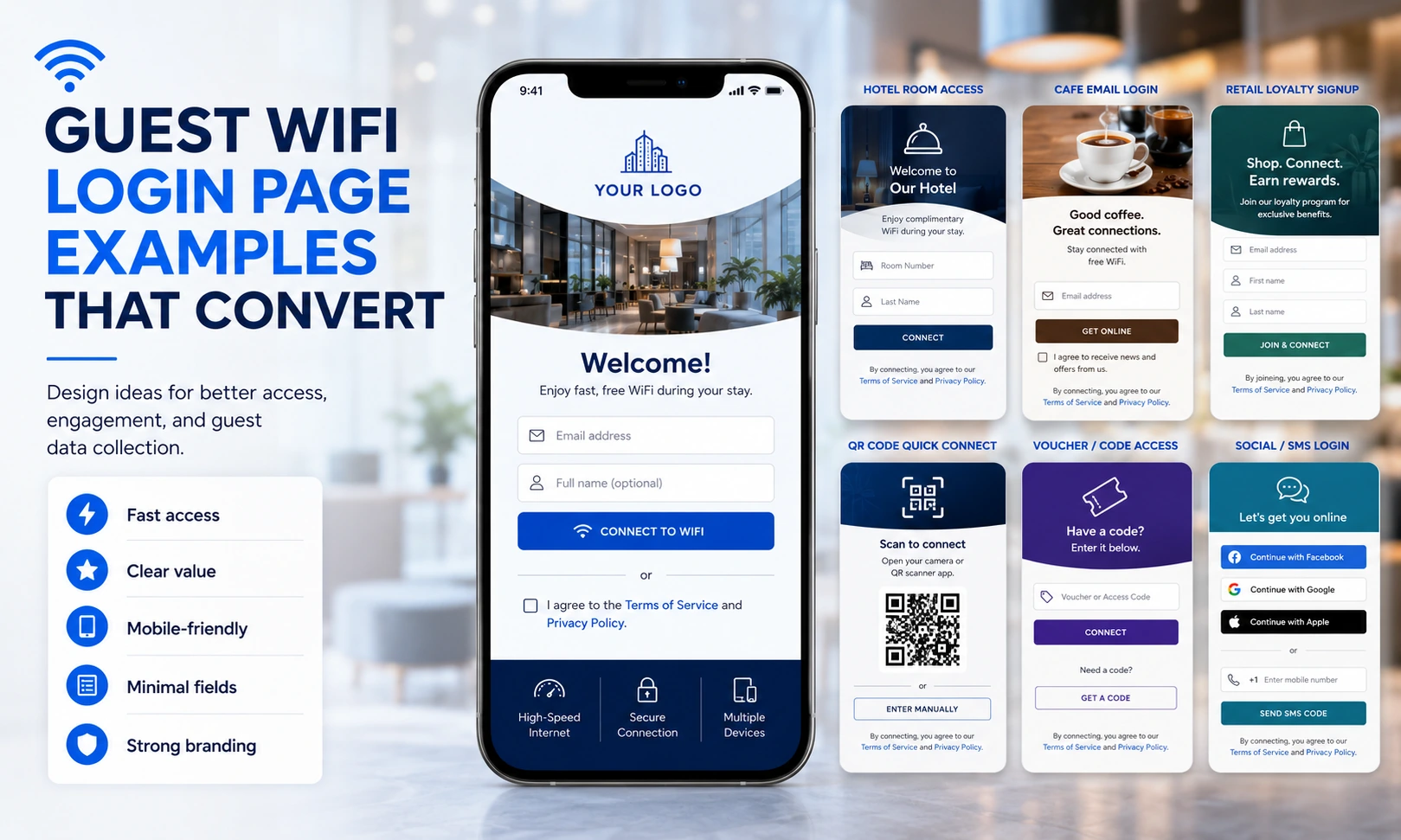
If you manage WiFi for a hotel, restaurant group, airport, hospital, campus, or retail chain, the login page is one of the few moments when network operations and customer engagement meet in one place. That is why weak captive portal design usually shows up fast in the metrics: lower login completion, poor data quality, more help desk requests, and missed marketing value.
What the best guest wifi login page examples have in common
Strong login pages are usually simple on the surface and highly intentional underneath. They reduce friction for the guest while giving the operator the right balance of authentication, branding, data capture, and policy enforcement.
That balance depends on the venue. A coffee shop may want fast social login and a promo banner. A hospital may need sponsor-based access, legal notices, and session controls. An airport may need multilingual support, ad inventory, and traffic shaping. The page design should reflect that operational reality, not just brand style.
The most effective portals generally share a few traits. They load quickly on mobile devices, present one clear path to access, explain any terms in plain language, and ask only for data the business can actually use. They also connect to back-end systems for analytics, campaigns, user management, and centralized administration.
12 guest wifi login page examples by use case
1. The hotel branded welcome page
A hotel login page should feel like part of the guest journey, not an IT checkpoint. The strongest version uses the property logo, a clean room-ready design, and a simple access choice such as room number plus last name, voucher code, or one-click free access for loyalty members.
This model works well because it supports brand consistency while allowing tiered access. Properties can offer free standard internet, upsell premium speed, or promote dining, spa, and late checkout offers before the session begins. For multi-property groups, the page can stay centrally managed while allowing location-level content.
2. The restaurant email capture page
Quick-service and casual dining operators often need speed more than anything else. A good restaurant example asks for an email or phone number, keeps the form to one screen, and gets the guest online within seconds.
The trade-off is data quality versus convenience. Email capture can support remarketing and coupon follow-up, but if the page asks for too much, guests will abandon it or use fake details. In this setting, short session onboarding usually beats long forms.
3. The social WiFi retail page
Retail environments often use social login to reduce friction and improve audience profiling. A typical example gives guests the option to continue with email, Facebook, Google, or another supported identity method, then presents a targeted promotion once login is complete.
This approach can work well for malls, branded stores, and pop-up environments because it connects WiFi access to marketing segmentation. Still, it depends on the region, the audience, and privacy expectations. Social login is useful when it adds speed and consent-based data collection, but it should not be the only access option.
4. The airport multilingual portal
Airports need scale, clarity, and resilience. A strong airport login page usually opens with language selection, clear time-based access rules, and service information that can be understood by international travelers with little patience and limited battery life.
The best example here is not visually complex. It is operationally disciplined. Advertising placements, premium access options, and sponsor branding may be included, but the core task remains obvious: connect now, understand the session rules, and move on.
5. The hospital compliant access page
Healthcare guest access demands a different standard. A hospital portal often includes terms of use, age-appropriate notices, privacy statements, and a clear distinction between patient, visitor, and staff access.
A well-designed example minimizes confusion during stressful moments. It may support SMS authentication, printed access codes, or front-desk sponsored login. The page should be calm, readable, and accessible, with no clutter that distracts from essential information.
6. The campus self-registration page
Schools, colleges, and training centers often need self-registration for temporary users without overburdening IT staff. A practical example lets guests register with email verification, sponsor approval, or a time-limited code generated by reception.
This model is effective because it preserves control. Administrators can apply bandwidth policies, content filtering, and session expiration rules while still giving visitors a manageable experience. In education, control usually matters as much as convenience.
7. The event and conference splash page
For conferences, trade shows, and temporary venues, the login page often doubles as a communication channel. One strong example includes event branding, agenda highlights, sponsor visibility, and a simple access path tied to a registration code or open click-through acceptance.
The page works best when it is built for high concurrency. Large crowds logging in at once can expose weak portal logic fast. In this setting, performance and caching matter just as much as appearance.
8. The paid access transport portal
Transit hubs, buses, ferries, and terminals may need to monetize internet access directly. A paid access page usually presents session packages, payment methods, and clear speed or time allowances before login.
This is one of the clearest examples of WiFi as a revenue service. The page must make pricing simple, support secure transactions, and reduce drop-off during payment. Confusing package names or extra registration steps will hurt conversions immediately.
9. The chain retail campaign page
Multi-location brands often want one login framework that can run different campaigns by site, region, or customer segment. A strong example uses a consistent corporate design with dynamic banners, localized offers, and central policy controls.
This matters because standardization lowers operating complexity. The same platform can support thousands of access points while marketing teams update creatives without changing core authentication logic. For chain operators, that is usually more valuable than having every store build its own page.
10. The voucher-based cafe portal
Small venues often prefer a voucher page generated from a POS, receipt printer, or front counter dashboard. The guest enters a short code and gets a defined access window.
This format is useful when the operator wants to limit misuse, reserve bandwidth for paying customers, or run timed access in busy locations. It is less effective when speed and repeat visits matter more than control. The right answer depends on customer flow.
11. The municipal or public venue page
Libraries, parks, city centers, and public buildings usually need broad accessibility with clear policy messaging. A good example offers click-through access, basic usage terms, optional surveys, and ADA-conscious design choices such as readable contrast and large touch targets.
Public access portals should avoid unnecessary barriers. If identity checks are too strict, support demands rise and adoption falls. If controls are too loose, abuse becomes harder to manage. The login page should reflect that public-service balance.
12. The loyalty-driven hospitality portal
A more advanced hospitality example ties login directly to a loyalty or CRM program. Returning guests see a recognizable brand experience, may bypass repeat registration, and can receive segmented offers based on stay history or visit patterns.
This is where the login page becomes part of a broader digital infrastructure. It is no longer just a gateway. It becomes a repeat-engagement tool backed by analytics, customer profiles, and campaign automation.
How to evaluate guest wifi login page examples for your own deployment
A visually polished portal is not automatically a good one. The real test is how well it supports your operating model.
Start with the access method. Do you need open access, email capture, SMS verification, social login, vouchers, PMS integration, payment acceptance, or sponsor approval? The correct answer depends on risk level, customer expectations, and the type of data your team can actually act on.
Then look at scale and management. A single-location cafe can tolerate manual updates. A hotel group, airport operator, MSP, or enterprise chain needs centralized templates, role-based administration, reporting, and the ability to push changes across locations without touching every controller or access point.
You should also evaluate what happens after login. Can the portal trigger surveys, collect analytics, display video ads, route users to landing pages, or support bandwidth upsells? If not, the business may be leaving value on the table. This is where platforms such as Start Hotspot fit best - when the requirement is not only guest access, but also policy control, monetization, and measurable customer engagement.
Design mistakes that hurt login completion
Most failed login pages share the same problems. They ask for too much information too early, load slowly on mobile devices, hide the connect button under marketing clutter, or force one identity method on every user.
Another common mistake is copying a portal style from a different industry. What works for a premium hotel may not work in a busy clinic. What works in a shopping mall may frustrate travelers in a terminal with weak battery life and no patience for long forms.
There is also a governance issue. If marketing controls the page without IT oversight, compliance and access rules may break. If IT controls everything without considering the user journey, the page may become technically correct and commercially ineffective. The strongest deployments treat the login page as a shared asset.
A guest WiFi login page should earn its place in your network stack. If it shortens access time, improves data capture, supports monetization, and stays manageable across locations, it is doing real work for the business - not just decorating the connection process.
Prefer Antamedia on Google
Get practical guest WiFi and network management insights directly from Antamedia.